Product Builder for WooCommerce
Visual product configurator with tile selection, conditional logic, file uploads, and smart formula pricing. The modern WooCommerce product addons alternative.
Product Builder Field Types
Field types control how a customer interacts with each option group. Pick the type that matches the decision the customer is making — a field that’s too flexible makes pricing and validation harder to explain.
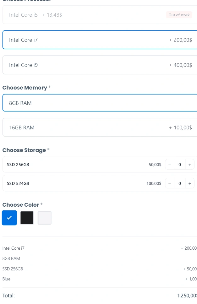
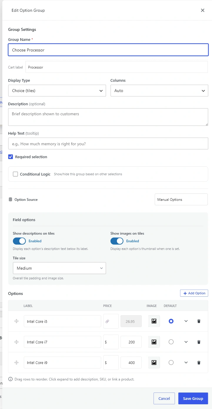
Choice (tiles)
Visual single-choice tiles with an optional thumbnail, description, stock badge and price. Best for selections where the visual matters (sizes, packages, materials).
- Field options: Show descriptions, Show images, Tile size (small / medium / large).
- Columns: auto, 2, 3, or 4.
- Default: one option can be pre-selected.
Choice (pills)
Compact horizontal pill buttons for single-choice selections that don’t need a visual. Best for sizes (S/M/L), short variant names and yes/no toggles.
- Field options: Button style (outlined / filled / minimal), Show price badge on buttons.
- Default: one option can be pre-selected.
Multi-choice
Multiple-selection checkboxes. Best for add-ons, extras and feature bundles where the customer should pick one or more.
- Field options: Minimum selections, Maximum selections (0 = no limit), Display style (tiles / compact list).
- Default: any subset of options can be pre-selected.
Quantity
Compact rows with a numeric stepper next to each option. Best for “how many extras” scenarios — the customer picks an option and a quantity in one move. The price slot shows the unit price when quantity is 0 (muted) and switches to the running line total when quantity is greater than 0 (active).
- Field options: Minimum quantity, Maximum quantity, Step, Starting quantity, Unit label (e.g. “GB”, “pcs”).
- Columns / Default: not used — each option has an independent quantity.
Color choice
Single-choice color swatches. Each option carries a hex color (or falls back to a default palette). Hover shows the option label and price adjustment.
- Field options: Swatch shape (square / circle), Swatch size (small / medium / large).
- Option fields: Swatch Color (hex).
- Default: one swatch can be pre-selected.
Text input
Free-form text entry. Best for personalization (engraving, custom messages, names).
- Field options: Input type (single line / textarea), Minimum and Maximum characters, Placeholder, Validation Pattern (regex).
- Pricing: None / Fixed price / Per character (uses the entered length).
File upload
Drag-and-drop file upload with chunked uploads for large files. Best for print-on-demand designs, document uploads and signed waivers.
- Field options: Minimum files, Maximum files, Maximum file size (MB), Allowed extensions (comma-separated).
- Pricing: None / Fixed price / Per file (uses the upload count).
Related
See Option Groups and Templates for the modal that exposes Field options, Pricing and Bulk Discounts for how each field type carries a price and Conditional Logic and Required Selections for hiding fields behind earlier choices.